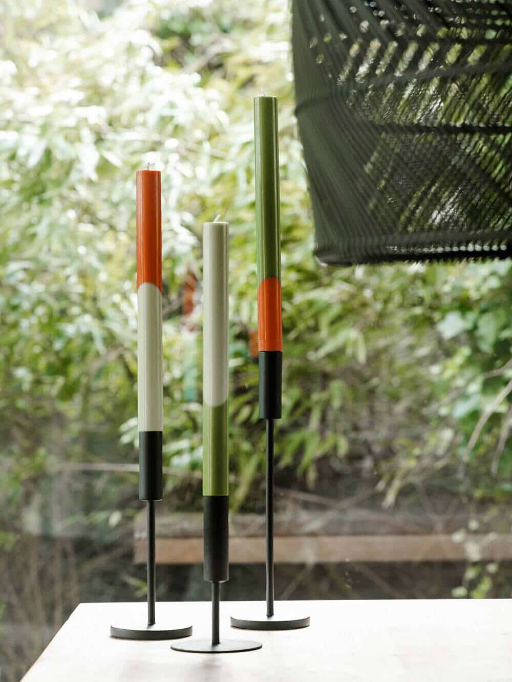
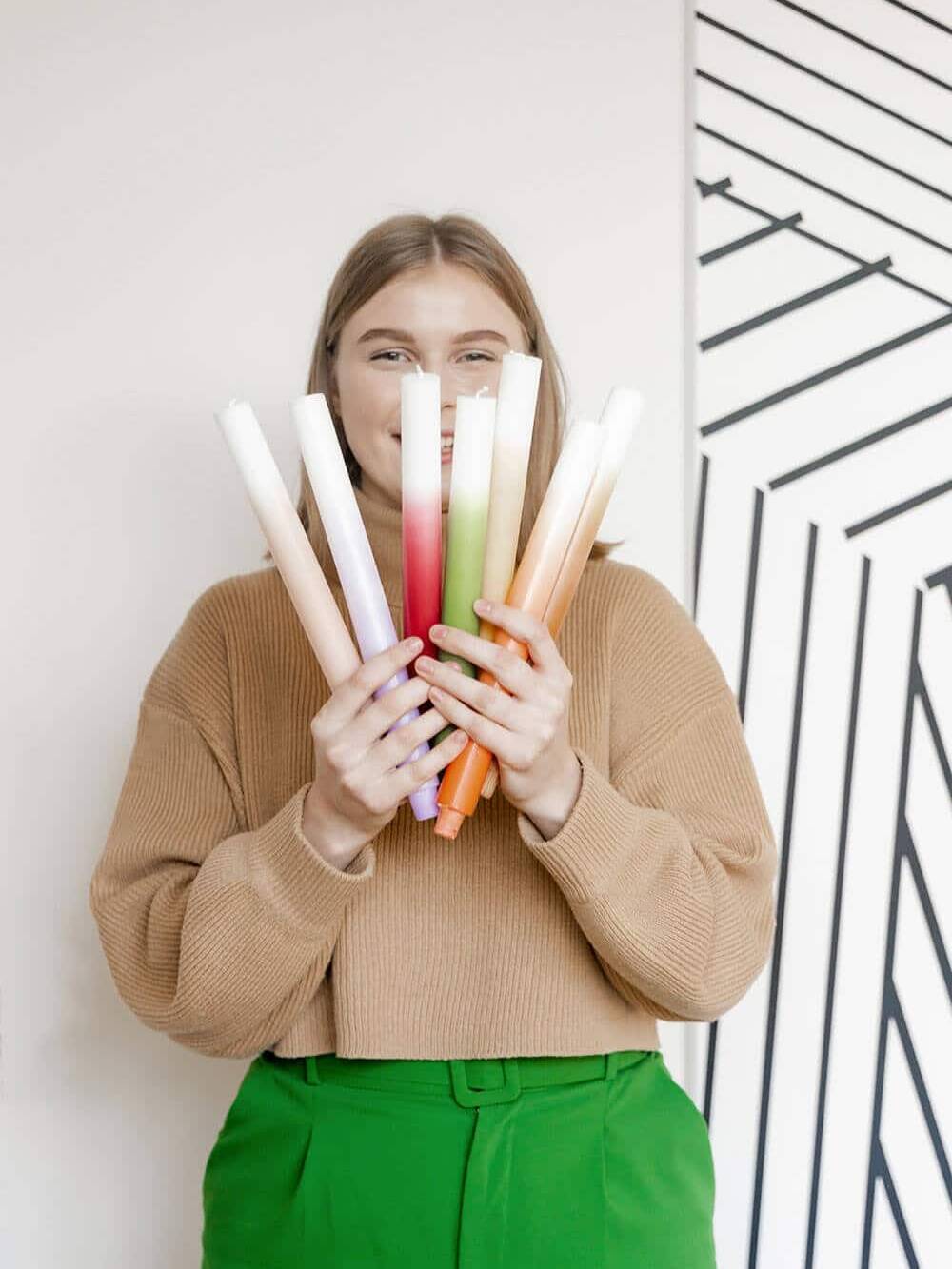
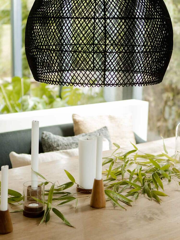
Energize your home with your personal set of inspiring colours
To create a different mood at home, a bright colour palette might give you the energy and motivation you need. Step away from the greys, browns and whites and you will immediately feel lightened up. You do not instantly need to paint all the walls in your favourite colour. Simply spice up your living room with coloured candles or cushions in your favourite colour palette. Or buy a large bouquet of bright coloured flowers to bring positivity to your home. Light up with colours!
Colour
Evokes emotions
Colours are thought to have an effect on our feelings, moods and behaviour. Certain colours are even associated with physical reactions like increased blood pressure or increased metabolism. Although there is no extended scientific research on the psychological effect of colours, researchers and experts have made a few important discoveries and observations about the psychology of colour. Feelings about colour are personal and rooted in our own experience or culture.
As an example: The colour white represents purity or innocence in Western countries while it is a colour of mourning in most Eastern Countries. And even within European countries colour has a different meaning in English, you are green with envy, in German yellow (gelb vor Neid sein).
Cross-cultural similarities
of warm and cool associations
While perceptions of colour are subjective, there are some colour effects that have universal meaning Colours in the red area of the colour spectrum like red, orange and yellow are known as warm colours and evoke emotions ranging from feelings of warmth and comfort to feelings of anger and hostility. Cool colours like blue, purple, and green are often associated with calmness or trust but also with feelings of sadness or indifference.
Colour influences
the perception of temperature
Whether you are feeling warm or cold can depend on the colour tone of your environment. In a room painted in warm colour, the temperature will feel warmer than the same temperature in a cool-coloured room. If you think of temperature-related associations to these colours, this is not surprising. Blue represents winter, ice, water, freshness, rain, wind, and your lips turn blue when you’re cold. Warm colours like red or yellow produce images such as fire, sun, and summer in your mind. They are not called ‘warm’ and ‘cool’ colours for nothing.
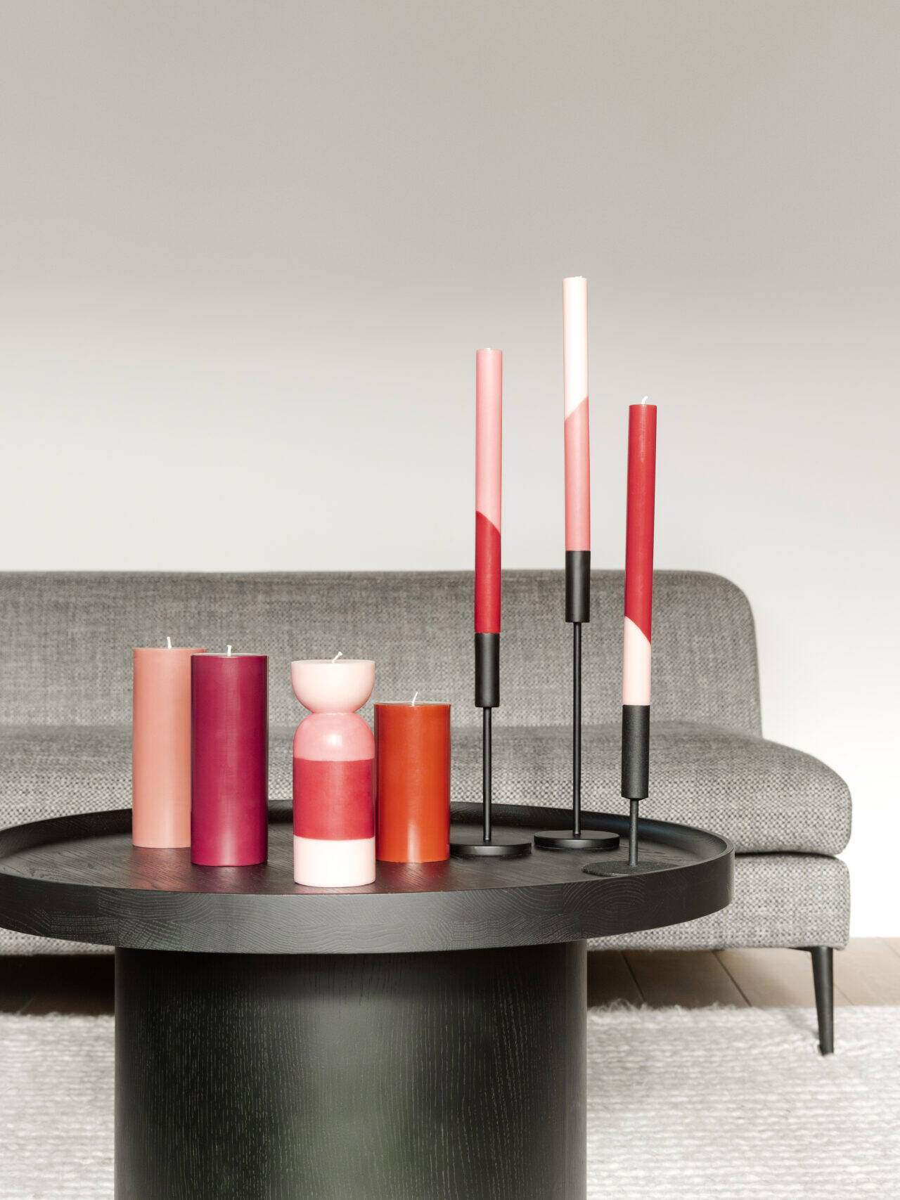
Our colour palette for spring/summer 2022 gives energy and inspires creativity
Lavender: The Pantone colour of the year 2022 is very peri, originalhome calls it lavender. This colour encourages personal inventiveness and creativity.
Sky: This light blue tone evokes feelings of calmness or serenity and relates to the fresh crisp blue skies we see in the springtime. It is also described as peaceful, tranquil and secure.
Blossom: This pale warm pink is described as relaxing and relates to the blossoming springtime evoking joy and happiness. This colour also stands for creativity.
Yellow: Yellow is an energetic colour that relates to warmth and brightness. It is a cheerful colour that can evoke happiness. Choose a soft yellow to avoid overstimulation.
Green: Symbolizes nature and represents tranquillity. It is thought to relieve stress and help to heal. Some researchers think our positive association with green is “hard-wired” in our brains from evolution: It indicates a place where food, water and shelter can be found.